People-first approach
Delivering successful products and business outcomes is about investing in people first.
Creative play
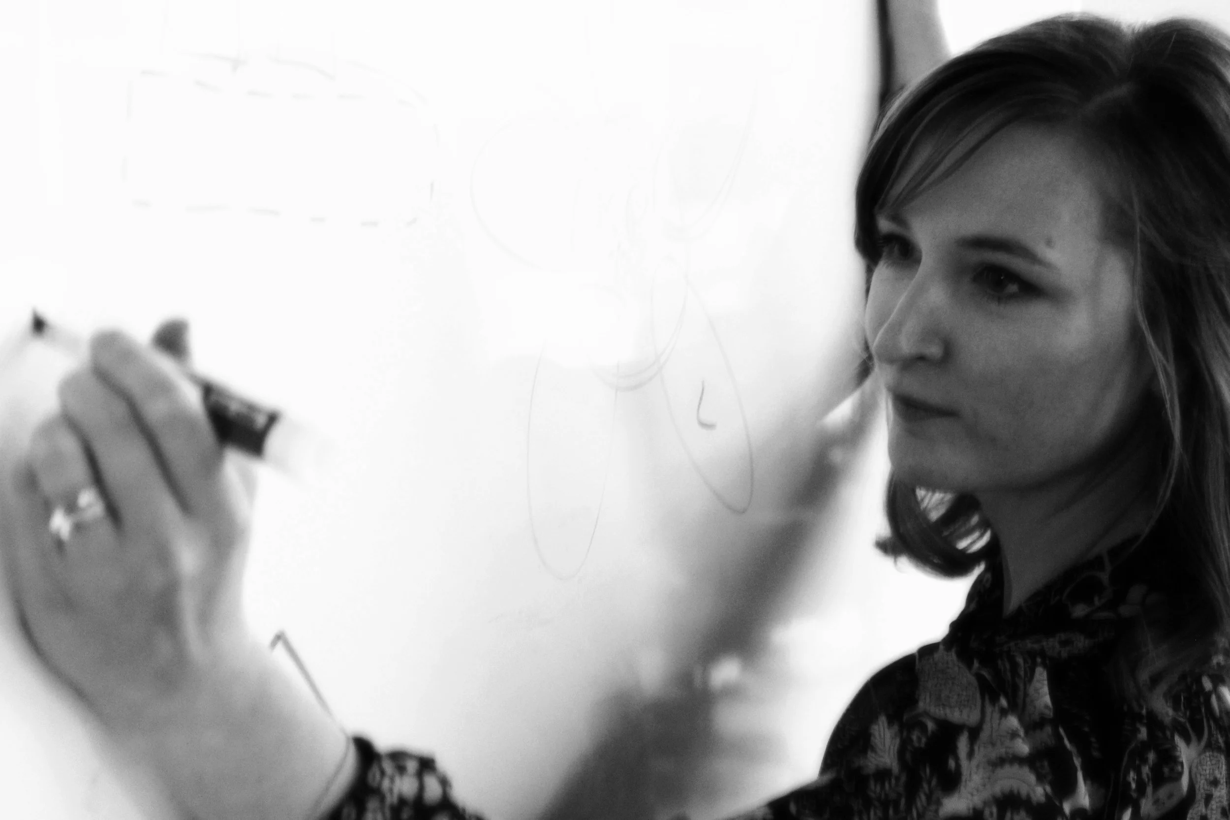
Creating space for play fosters an innovative, supportive design culture by building trust, enhancing problem-solving, and sparking new ideas. This photo was taken during a 2023 cross-office “art class” I hosted to lift team morale during a challenging time. Teams that embrace creativity and collaboration grow stronger and more resilient over time.
Ease of use metrics
Ease of use metrics, like task completion and error rates, are important UX accountability measures. This data informs product investments and can be a strong indicator of renewal risk and churn. I am the leadership sponsor for Golden Path metrics at Qualtrics, our primary ease of use metric reported in monthly business reviews.
Journey-centered ideation
One of the most effective ways to build empathy and unify teams is by grounding ideas and assumptions in the context of the user journey. This ensures we stay focused on real user needs, even under tight deadlines or executive pressure. For instance, when tasked with creating an 'AI innovation demo' for a leadership summit, the UX and product teams recognized overlapping efforts across the portfolio. By using FigJam and a dedicated Slack channel, we organized ideas around the user journey asynchronously, collaborating across 6+ product teams in under a week. This approach not only resulted in a cohesive, user-focused demo but also enhanced the contributions of each team member.
Passion projects
Personal passion projects fuel individual growth and expand impact beyond the person or team. Two examples include initiatives for AI ethics guidelines and an accessibility awareness campaign, both of which began as grassroots efforts and continue to influence the organization today.
I’m constantly inspired by the passionate people I work with and motivated to create space for their ideas to develop and thrive. Supporting passion projects helps individuals shape their futures while building a more creative and innovative team.
Human Centered Design milestones
Human-centered design emphasizes the human perspective at every step—from research and concept development to implementation and evaluation. I believe that while you can't skip steps, you can adapt how you move through the process. To balance holistic user-centered processes with flexibility and speed at Qualtrics, I collaborated across UX, product, and engineering leadership to define and implement human-centered milestones at the organizational level. This led to smoother planning cycles and better management of dependencies, empowering designers to autonomously plan and estimate work while aligning expectations across partners and peers. Ultimately, this fostered a culture of autonomy and user-centricity across teams, enhancing collaboration and driving innovation.
Cross-functional retrospectives
Retrospective or reflection workshops provide a structured opportunity for team members from different disciplines to reflect, learn, and improve together. This practice was especially important for our leadership teams, 10 months into forming the XM Product unit. Many engineers were working with UX counterparts for the first time, and all groups were chartered with broader, more ambitious product and business goals. Taking a moment to come together and reflect on what teams are proud of, what they need or want, and how they might work together to improve their teams' experiences and outcomes, proved to be an effective and engaging way to enhance collaboration, promote inclusion, and facilitate growth.
Celebrating success to inspire growth and connection
I love celebrating my team's successes, big and small, because it’s not just about boosting confidence and morale—it’s about sharing and learning from each other's success. These images capture some of our moments, like an org-wide kind words activity for Valentine's Day, team-voted kudos awards, individual spotlights, and anniversary celebrations. It's these little acts of recognition that help create a culture where everyone feels valued, appreciated, and inspired to grow.
Consistent, yet flexible team syncs
Connecting regularly as a team is essential, but the way we connect should be tailored to each team's unique rhythm and needs. These snapshots from the same day show two different approaches: one team of eight, mostly co-located, prefers gathering in person every Monday using a FigJam board; the other, a smaller team of four spread across time zones, connects asynchronously via Slack. In both settings, I ensure we cover the essentials—learnings from the previous week, upcoming priorities, blockers, and a touch of fun. I'm intentional about what we discuss but adaptable in how we get there, always prioritizing what works best for the team.
Async crits
I find that asynchronous feedback rhythms can be a great way to gather thoughtful input from a globally distributed team, especially in a matrix product organization. Even when teams are colocated, this approach lets everyone engage in a critique at their own pace. Tools like FigJam, with its intuitive interface and templates, make it easy to set up a well-structured async crit, leading to more frequent and inclusive design feedback for higher-quality outcomes and team enagement.
Professional development & individualized growth
I prioritize time with my team members individually each week, and at least once a quarter, we set aside time for more focused performance feedback and career action planning. I start with a collection of tools and templates (such as 1:1 hubs, performance review templates, and career action planning frameworks), and I always adapt these to suit each team member's unique goals, working style, and aspirations, ensuring that our growth conversations are genuinely personalized and impactful.
UX Heuristics
UX heuristics are a powerful tool for evaluating products through established principles like Nielsen’s 10 usability heuristics. This structured approach helps uncover usability issues and prioritize improvements, ensuring a more seamless user experience. This example was created at Moz and used quarterly to evaluate and prioritize product improvements.
UX vision narrative
Communicating future concepts through narratives grounded in validated user needs fosters empathy and keeps the product vision user-centric. This example, part of a UX vision deck led by Claudia Martinez with concept illustrations by Kaitlin Mortensen and Lena Tran, was shaped by quantitative and qualitative research led by Melody Wu and Rose Schnider, and insights from a cross-functional session on user pain points facilitated by Claudia and Rose.
Employee Engagement feedback
I’m grateful for the opportunity to regularly review employee engagement metrics at Qualtrics and to learn directly from the team about what’s supporting them—and what’s not. The numbers aren’t always pretty, but the feedback is invaluable in guiding our efforts to enhance team engagement. EE results are just one of the many tools I use to empathize with the team, understand what problems they need me to focus on, and work with them to improve our collective experience.
Story flows
Storyboards and wireflows can be helpful tools for working through concepts more holistically. This is an example I drafted to explore how we might effectively leverage the mobile form factor to enhance an existing desktop experience.
Customer journey mapping
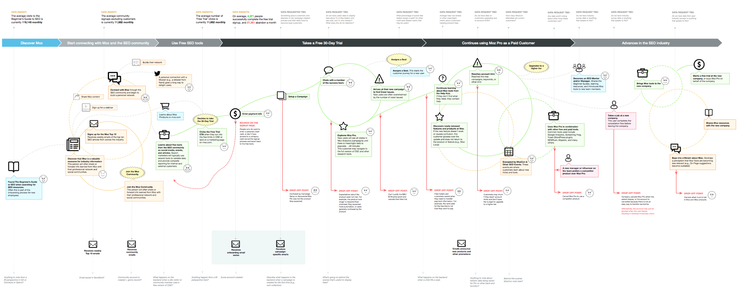
Customer journey maps are powerful tools to align teams, prioritize issues, and enhance customer empathy. This example maps customer touch points, internal systems, quantitative and qualitative data points, and opportunities for improvement. This is one I developed at Moz in partnership with a User Researcher, Jackie McGuire.
Conversation maps
I love this concept of a conversation map that I learned from Steph Hay to help designers and product teams work through user flows and content hierarchy. This "content-first" approach focuses on the language and conversations customers use rather than interfaces or features. The example here is from a design effort I led around Moz subscription management to keep teams user focused and aligned around the complex technical and business requirements. The deliverable resulted in a Google doc organized by user scenarios to discuss anything UX-impacting from messaging needs to technical limitations through development and post-launch revisions.
Hands-on wireframing
Sometimes it helps to break free from traditional tools and get a little more hands on. In this case study, we faced a challenge with high customer churn before the end of their free 30-day trial. Our dashboard was key to showcasing value early, but delays in customer data availability were a hurdle. We analyzed usage data to inform key use cases to support, and then physically arranged wireframe elements to work through key scenarios and dependencies — I call these wiretiles.
This was an engaging experience for the team and led to a modular system for smoother onboarding. The solution improved free trial conversion and effectively supported product growth for the next 2+ years.
In summary, I gravitate toward collaborative tools and tactics that foster inclusive discussions, helping build more connected and engaged teams while celebrating iteration and growth. I would love to learn what human-centric leadership approaches work for you and your teams!


